[DW for tumblrites masterpost]
All right, so you're settling into your DW blog, but you want to make it look prettier. This is where Styles and Themes and Layouts come in. I'm not super good at it myself, but here goes:
To start, you need to pick a theme by going to Organize -> Select Style. There's a lot! Over 1500! BUT: if you click on "Base Styles", then there's actually only 58. These are the core style families. So now, instead of 1500 to choose from, there's 58.
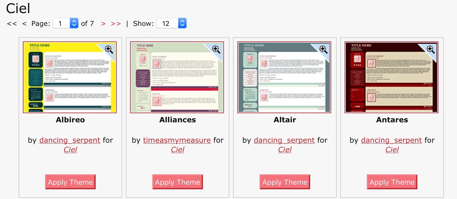
At the bottom of each, you see the creator and the name of the base style. If you click on the base style name, it'll show you all the variants of that style. For example, "Ciel" has 80+ variants, made by various people:
If you find yourself liking a particular creator, you can also browse by creator. When you click on the little magnifying glass on the corner, it loads up your journal in that style.
Since you can easily tweak the colors later, the stuff I generally look for are the relative placement of things:
- Where is the usericon placed, relative to the text?
- Is there a good handling of the header bar area?
- Does my reading page look good?
- When I shrinkify it to mobile size, does it look good?
Before you run off to browse through the base styles, I actually went ahead and clicked on all 58 of them and tested which ones degrade well when I shrink my browser window to phone-sized. Only 16 of them didn't pass the "eh this doesn't look that great" test. Which means that almost 3/4 of them did!
The 16 less-mobile-friendly ones are:
After you select a theme, then the customization can begin! (Go to Organize->Customize Style). You can change basically everything about it -- upload new header or background images, change how many columns you want, change the font or the standard titles of things, change the colors, etc. There's even a "Custom CSS" section where you can override the current style's CSS with your own. There's a whole DW community dedicated to helping you with that:![[community profile]](https://www.dreamwidth.org/img/silk/identity/community.png) style_system
style_system
... or, you can find a "layout" that someone else made and follow the instructions from the layout creator (which mostly involves copy-pasting a chunk of code into the Custom CSS area.) You can find mobile-friendly layouts at the fluid layouts tag ofdreamwidthlayouts, but I also want to pimp myrtillenne's layouts because they are stunning: https://myrtillenne.dreamwidth.org/tag/dreamwidth
After you get your theme set up, you may want to double check it on mobile, which brings us to:
Using DW on Mobile
There's no app, and frankly, given that the whole tumblr thing is in part due to Apple app store stuff, I don't really want there to be a DW app. But how do we make the mobile DW experience better? Since the themes are actually pretty mobile-friendly, the main challenge is actually navigating through the DW website to get to the reading and post pages. Solution: make bookmarks. Most browsers even let you save a bookmark as a shortcut icon you can click on your home screen.
But if you're looking for a slightly more streamlined experience, here's what I've got set up:
1) A dedicated browser for DW, with the only bookmarks in the browser links to my core DW functions. This means that opening that browser is like opening a DW app.

2) A way to do split screen with the browser, so that I can scroll through my reading page, then quickly pull up my post page to make a quick "reblog" post.
Here's how I did it on my Android 6
On recommendation from![[personal profile]](https://www.dreamwidth.org/img/silk/identity/user.png) bluewinged_songbird, I downloaded the "Hermit" app, which basically creates customized browser instances. With that, I created a "lite app" that has my reading page set as the homepage, and the reading, posting, and upload pages set as "bookmarks" that appear in the hamburger menu.
bluewinged_songbird, I downloaded the "Hermit" app, which basically creates customized browser instances. With that, I created a "lite app" that has my reading page set as the homepage, and the reading, posting, and upload pages set as "bookmarks" that appear in the hamburger menu.
Here's the part where I can tweak my bookmarks:

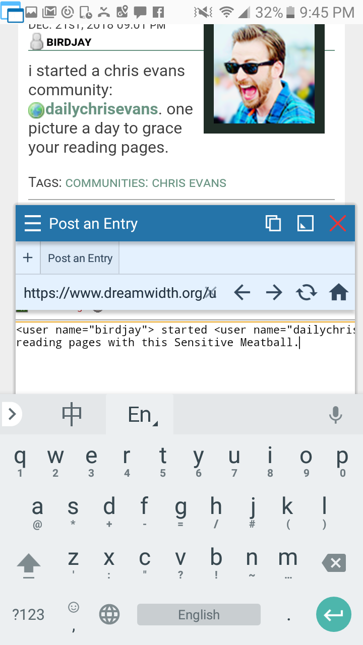
Then I went looking for a split screen app, but didn't find a good one. Instead, I found "Floating Apps", which basically has a suite of apps that can be dragged around anywhere on the screen and quickly minimized into a tiny button. One of those apps is a browser, so after some fiddling, I set up a browser shortcut icon that pulls open my posting page at the right size and location. It minimizes into a little floaty button, so when I'm browsing, it looks like this:

(see the little round nubbin on the left side of the screen?)
And when I get to something that I want to reblog, I just tap it and it opens up my posting window.
Note: the beta posting interface is more mobile friendly, and looks like this:
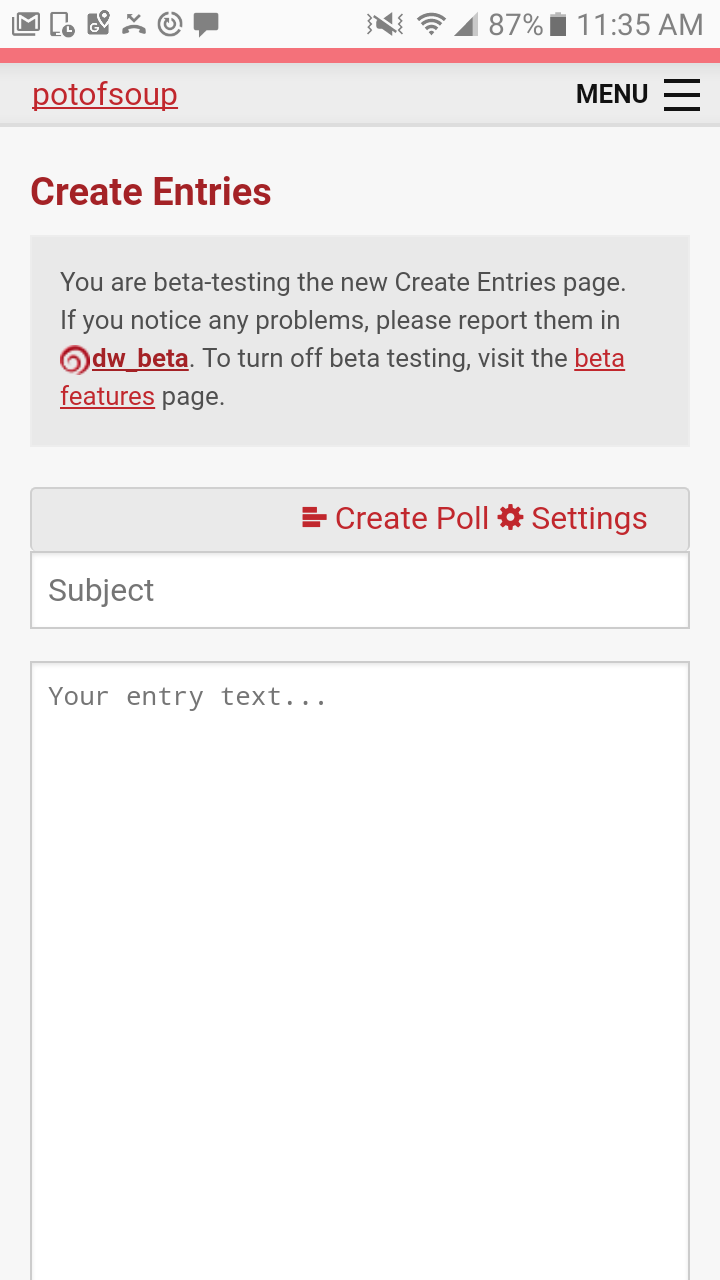
You can activate it by going to Organize -> Test Beta Features.
I personally decided to keep mine the normal way because (a) I don't plan to post too much via mobile, and (b) sometimes I want to use the Rich Text feature, but YMMV.
All right, so you're settling into your DW blog, but you want to make it look prettier. This is where Styles and Themes and Layouts come in. I'm not super good at it myself, but here goes:
To start, you need to pick a theme by going to Organize -> Select Style. There's a lot! Over 1500! BUT: if you click on "Base Styles", then there's actually only 58. These are the core style families. So now, instead of 1500 to choose from, there's 58.
At the bottom of each, you see the creator and the name of the base style. If you click on the base style name, it'll show you all the variants of that style. For example, "Ciel" has 80+ variants, made by various people:
If you find yourself liking a particular creator, you can also browse by creator. When you click on the little magnifying glass on the corner, it loads up your journal in that style.
Since you can easily tweak the colors later, the stuff I generally look for are the relative placement of things:
- Where is the usericon placed, relative to the text?
- Is there a good handling of the header bar area?
- Does my reading page look good?
- When I shrinkify it to mobile size, does it look good?
Before you run off to browse through the base styles, I actually went ahead and clicked on all 58 of them and tested which ones degrade well when I shrink my browser window to phone-sized. Only 16 of them didn't pass the "eh this doesn't look that great" test. Which means that almost 3/4 of them did!
The 16 less-mobile-friendly ones are:
- Blanket
- Drifting
- Database
- EasyRead
- Fantaisie
- Five AM
- Leftovers
- Line Up
- Patsy
- Pattern
- Seamless
- Snakes & Boxes
- Tectonic
- Trifecta
- Venture
- Zesty
After you select a theme, then the customization can begin! (Go to Organize->Customize Style). You can change basically everything about it -- upload new header or background images, change how many columns you want, change the font or the standard titles of things, change the colors, etc. There's even a "Custom CSS" section where you can override the current style's CSS with your own. There's a whole DW community dedicated to helping you with that:
... or, you can find a "layout" that someone else made and follow the instructions from the layout creator (which mostly involves copy-pasting a chunk of code into the Custom CSS area.) You can find mobile-friendly layouts at the fluid layouts tag of
After you get your theme set up, you may want to double check it on mobile, which brings us to:
Using DW on Mobile
There's no app, and frankly, given that the whole tumblr thing is in part due to Apple app store stuff, I don't really want there to be a DW app. But how do we make the mobile DW experience better? Since the themes are actually pretty mobile-friendly, the main challenge is actually navigating through the DW website to get to the reading and post pages. Solution: make bookmarks. Most browsers even let you save a bookmark as a shortcut icon you can click on your home screen.
But if you're looking for a slightly more streamlined experience, here's what I've got set up:
1) A dedicated browser for DW, with the only bookmarks in the browser links to my core DW functions. This means that opening that browser is like opening a DW app.
2) A way to do split screen with the browser, so that I can scroll through my reading page, then quickly pull up my post page to make a quick "reblog" post.
Here's how I did it on my Android 6
On recommendation from
Here's the part where I can tweak my bookmarks:
Then I went looking for a split screen app, but didn't find a good one. Instead, I found "Floating Apps", which basically has a suite of apps that can be dragged around anywhere on the screen and quickly minimized into a tiny button. One of those apps is a browser, so after some fiddling, I set up a browser shortcut icon that pulls open my posting page at the right size and location. It minimizes into a little floaty button, so when I'm browsing, it looks like this:
(see the little round nubbin on the left side of the screen?)
And when I get to something that I want to reblog, I just tap it and it opens up my posting window.
Note: the beta posting interface is more mobile friendly, and looks like this:
You can activate it by going to Organize -> Test Beta Features.
I personally decided to keep mine the normal way because (a) I don't plan to post too much via mobile, and (b) sometimes I want to use the Rich Text feature, but YMMV.
no subject
Date: 2018-12-22 04:13 pm (UTC)<3 <3 <3 (I really want more comms where I can subscribe and see
hot mencool images, a la tumblr!)no subject
Date: 2018-12-23 05:49 am (UTC)Sebastian Stan one too but IDK how many people would subscribe ....
no subject
Date: 2018-12-23 05:51 am (UTC)well, pace yourself? See how the CEvans one goes first? I saw that you're also doing prompthell, so clearly you're busy!! <3 <3 <3